Windows Explorer is good, but it does not have many features that makes my computer life easier. One thing I don’t like is that you can’t filter your view in an efficient way. Take for example this directory with my LaTeX files for one of my lectures:

If I want to open one of my tex-files, I have to search for it, or sort the folder. Directory Opus (DOpus), my windows explorer replacement, handles this very nicely. Here is the same folder using DOpus:
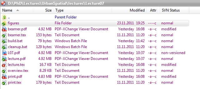
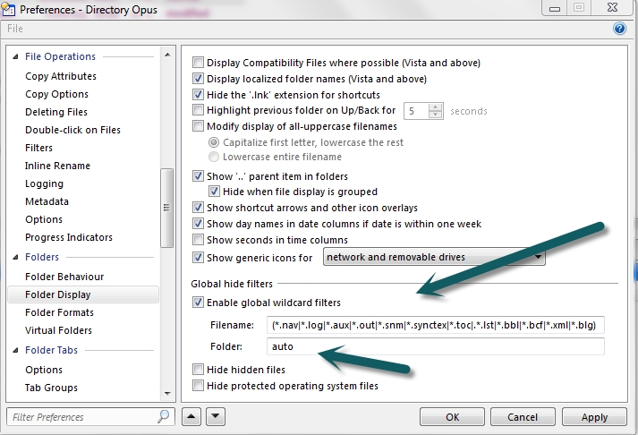
Now, that is a difference! I have a global filter, that hides all the other stuff. Just change your preferences as follows:
Another nice feature is the filter bar:
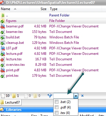
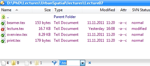
When I choose “.tex” my folder looks like this:
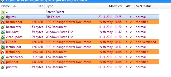
But this is not all. You can highlight, change the background, etc. using your own filters. For example, I want to have all recently changed files to be highlighted. This allows me to see with one quick glance, which files changed, and should be committed to my subversion repository (Of course, if you use TortoiseSvn like I do, you see the red exclamation mark, but new files aren’t marked). In DOpus this would look like this:
DOpus is not free, but it is not very expensive. Furthermore, DOpus is already 22 years on the market. Recently, they started offering a light version that only costs about 30$ (but doesn’t have all the nice features of the Pro version).
It might be worth considering this explorer replacement…


Nice one!
Btw: I really love Directory Opus. Got to know about it after reading one of your posts. Thanks a lot.