With R you can make beautiful graphics and the nice thing is, you can design your own customized graphics. For some nice graphs produced with R, have a look at http://addictedtor.free.fr/graphiques/.
At the moment I am working on a parking model (searching for parking lots in the city) and have a simple grid for the streets and the junctions. If you start working with network models you have the problem that there is basic information for every node and on top of that you have for every node your results. Trying to interprete the results is hard. Either you have a huge excel sheet with lots of numbers for every node or you try to catch specific results in your model by filtering the output and looking at your model results listing.
R gives you the possibility to draw your network with all the information near the nodes. I first wrote all the numbers near the nodes with different colors, then I used arrows in different colors and different sizes. That was all nice, but still hard to read.
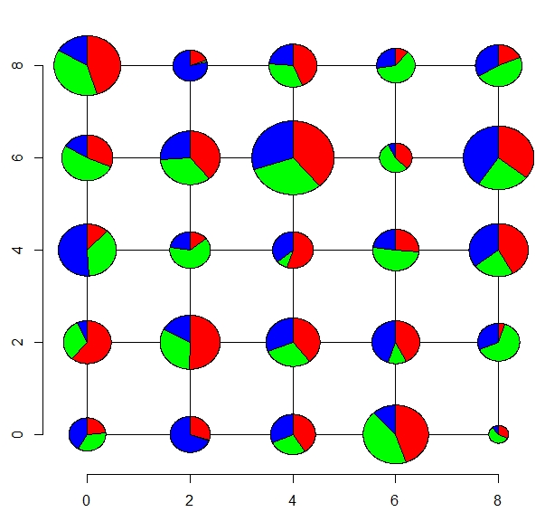
What I really wanted was to have something like a piechart or bars for every node directly plotted on the grid.
In R this is possible. You can use the x- and y-coordinates of your nodes and the drawing function polygon(). With some basic geometry (wihich I had to look up….) and ideas from Bálint Czúcz (http://addictedtor.free.fr/graphiques/RGraphGallery.php?graph=143) ,
I managed to write a R-script that takes the number of results per nodes (in my case 3, but you can have as many as you want), the grid size (in my case 5×5, but you can also use a real grid for a specific citiy). The script calculates the relative sizes of the results or basic information (for example number of old people, number of young people, number of adults = (0.3, 0.2,0.5)) and the relative size of the total (in node a we have the most people, in node b we have only 50%) and uses this information to draw scaled piecharts.
In the nex figure you see the results. You now can easily see that in this case mose people live in the node with the coordinates (4,6) and that every group has about the same size.

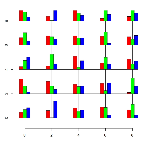
Another way would be using bars:

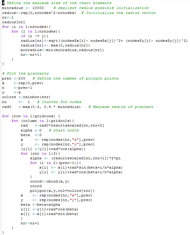
Here is the most important of the code (pie chart)


No, thanks for the link!
Have been poking around various r-projects recently. Are you aware of this package, built to demo data on transportation projects? https://github.com/ropensci/stplanr